






Nifest
Everybody is star
Project Type
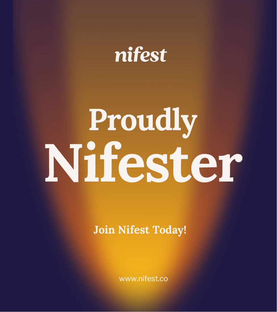
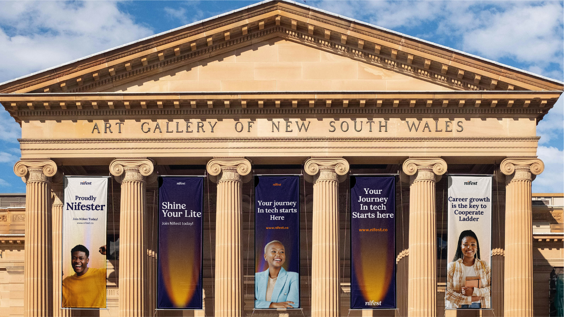
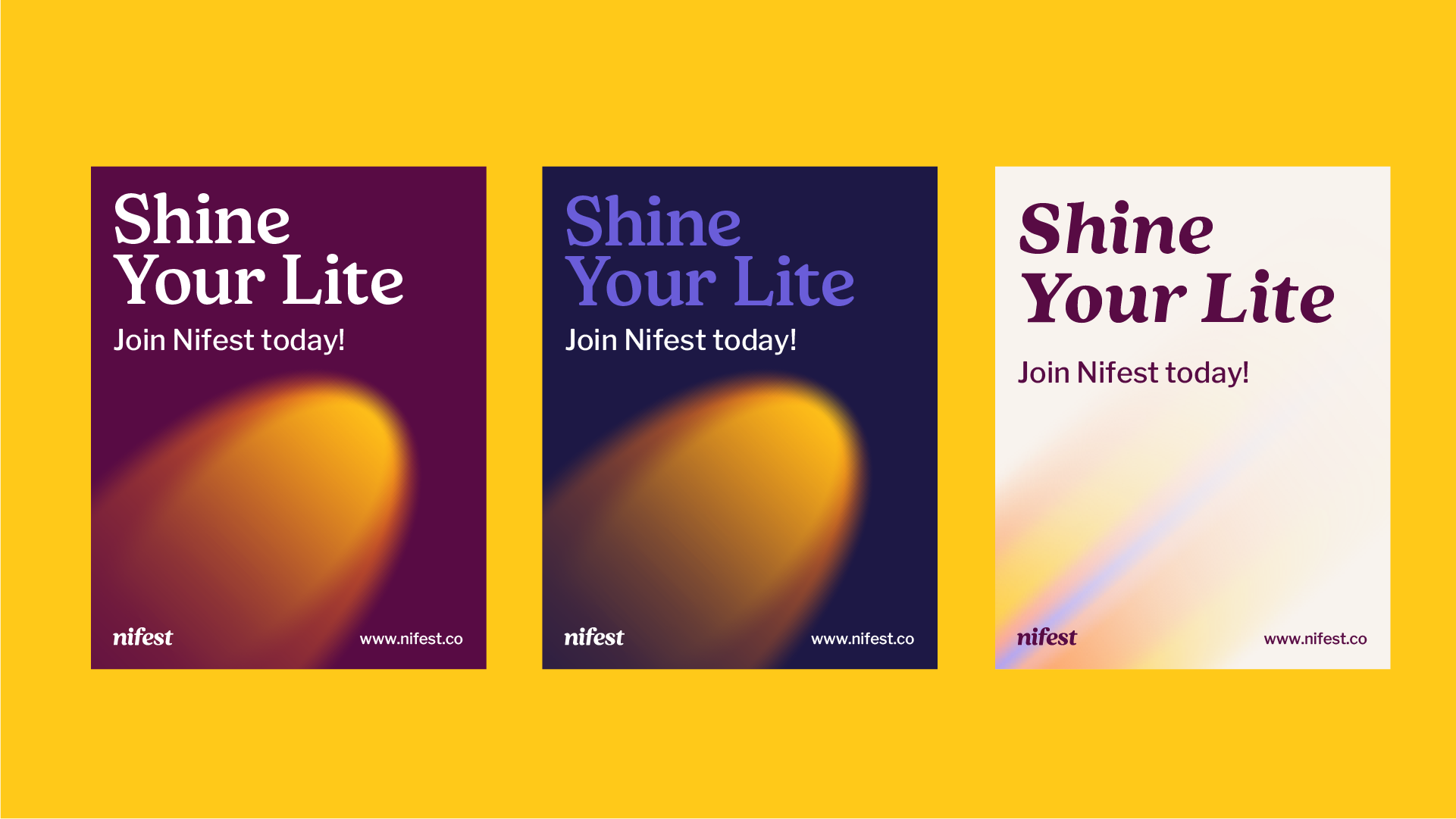
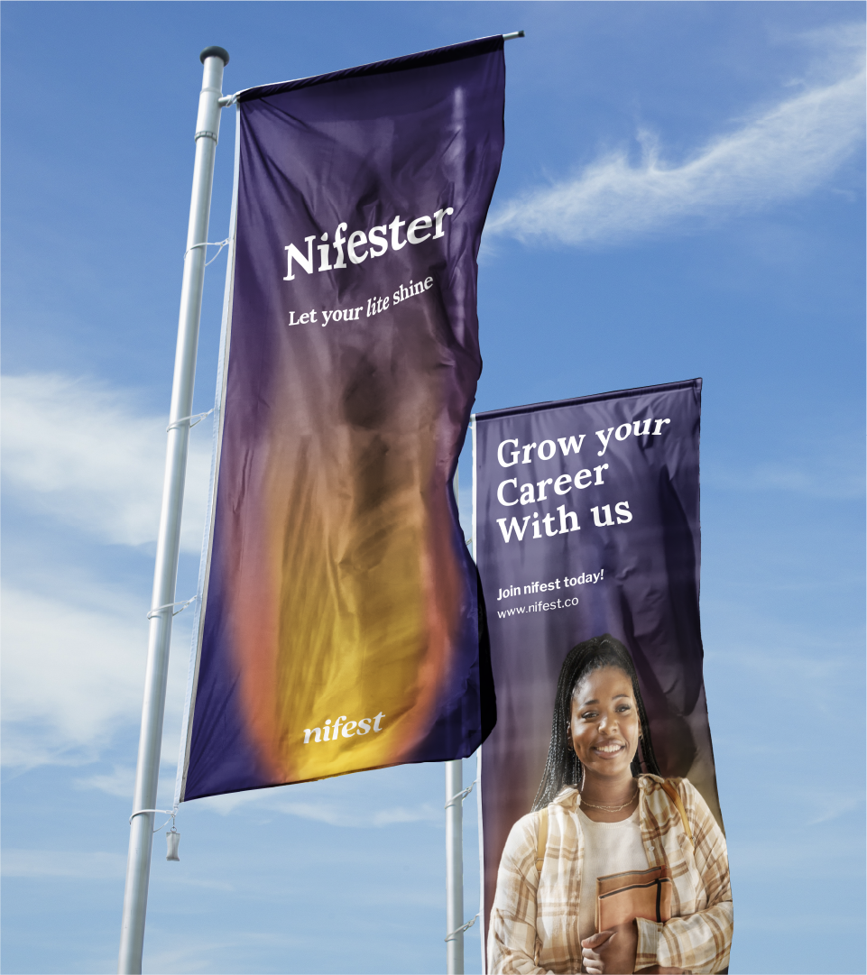
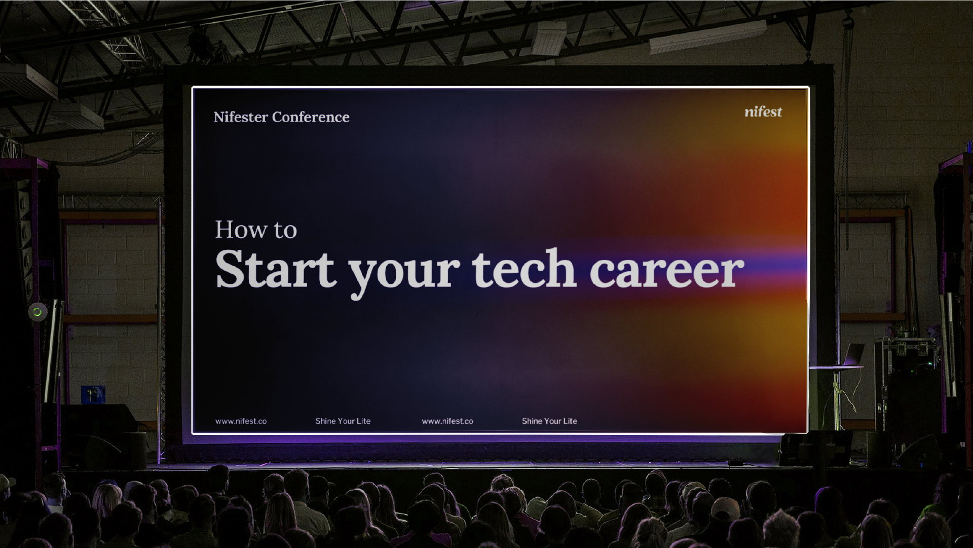
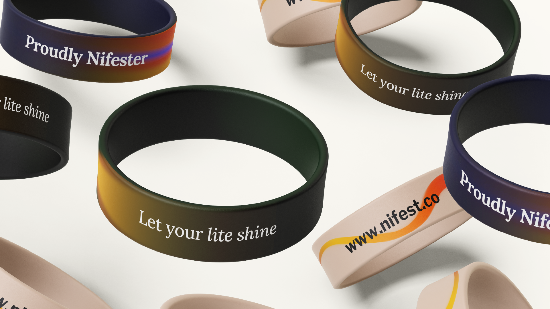
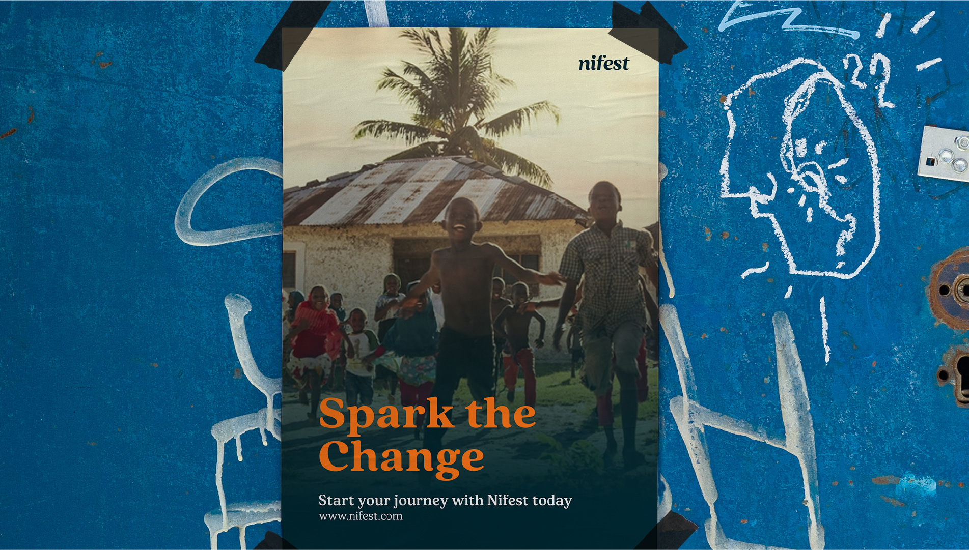
At Nifest, every individual is regarded as a star and a source of light that should shine brightly, a concept derived from the word MANIFEST. Nifest aims for each student to radiate and showcase their light to the world. As an Edutech company, they prioritize digital skills development, with the objective of equipping students with valuable, comprehensive skills and providing them with enriching experiences to effectively navigate the job market.
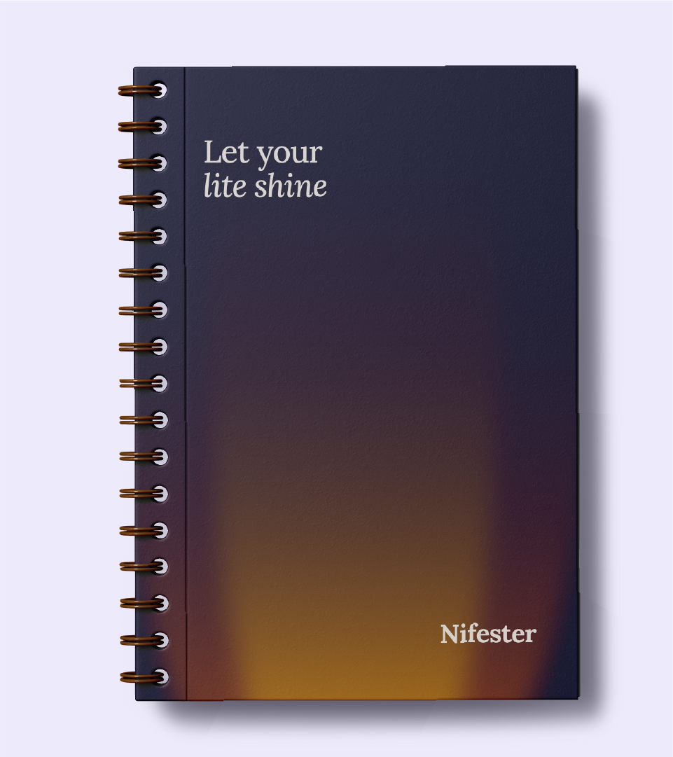
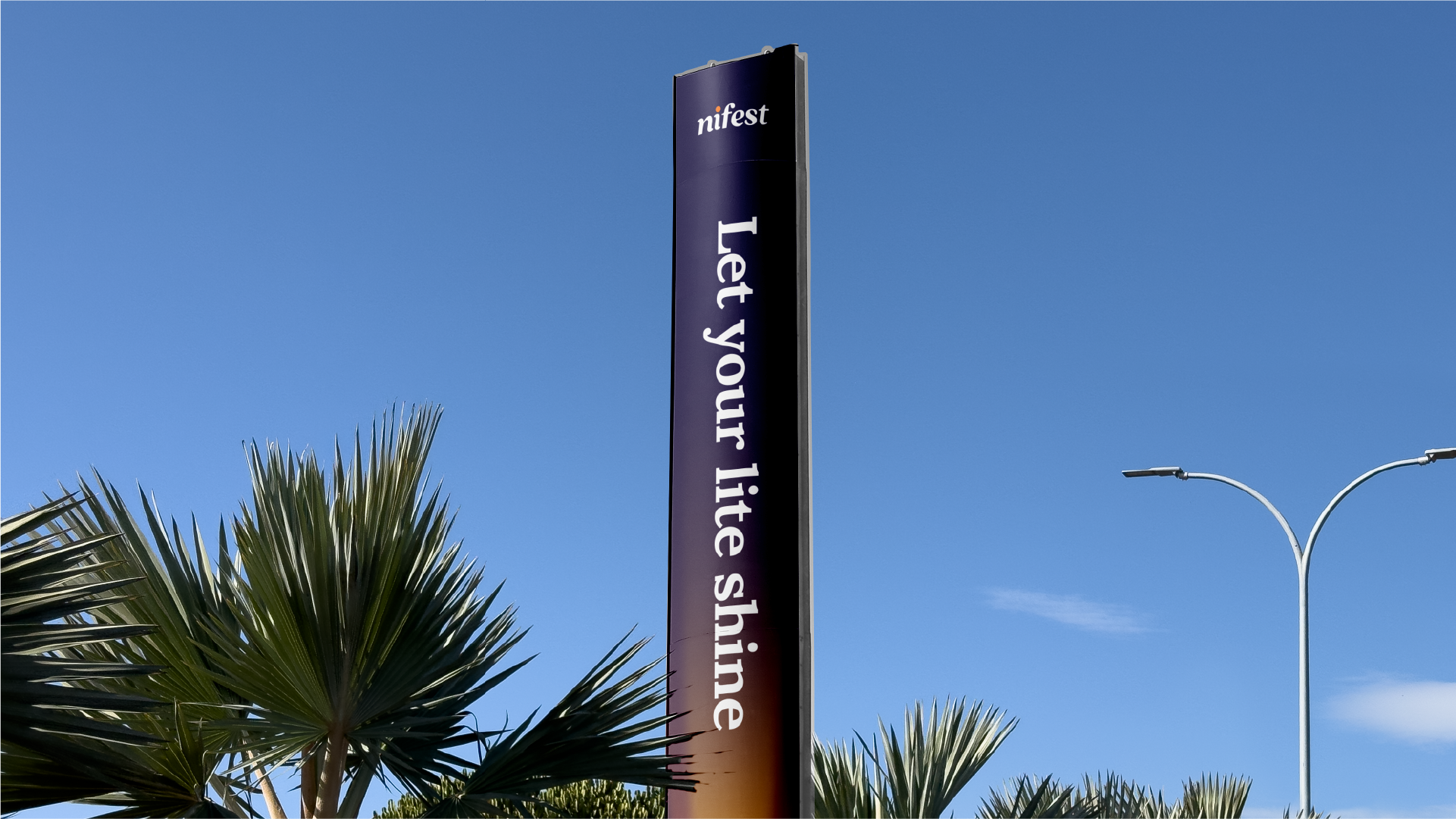
The letter “I” in the name was capitalized to symbolize THE TORCH, a motif that inspired every other aspect of the project. The torch symbolizes illumination, helping to light up spaces and ignite others, aligning with Nifest’s mission.
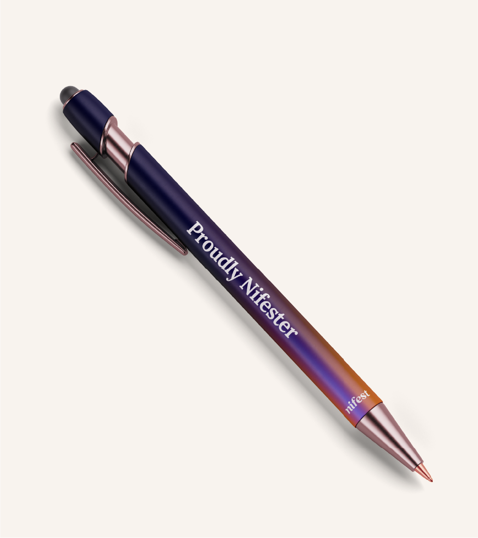
Light travels swiftly and disperses in a prism, a principle reflected in the brand’s typography and color palette. The dynamic movement of light serves as an inspiration for the brand’s glowing appearance and its visual identity device, which resembles the dispersal and spectrum of light.
Next projects

Flow
Brand Identity, Motion, Copywriting

Greenfed
Brand Identity, Motion, Copywriting
Hoyes Kitchen
Brand Identity, Motion, Copywriting
Next project

Nifest
Lorem ipsum dolor sit amet, consectetur
