
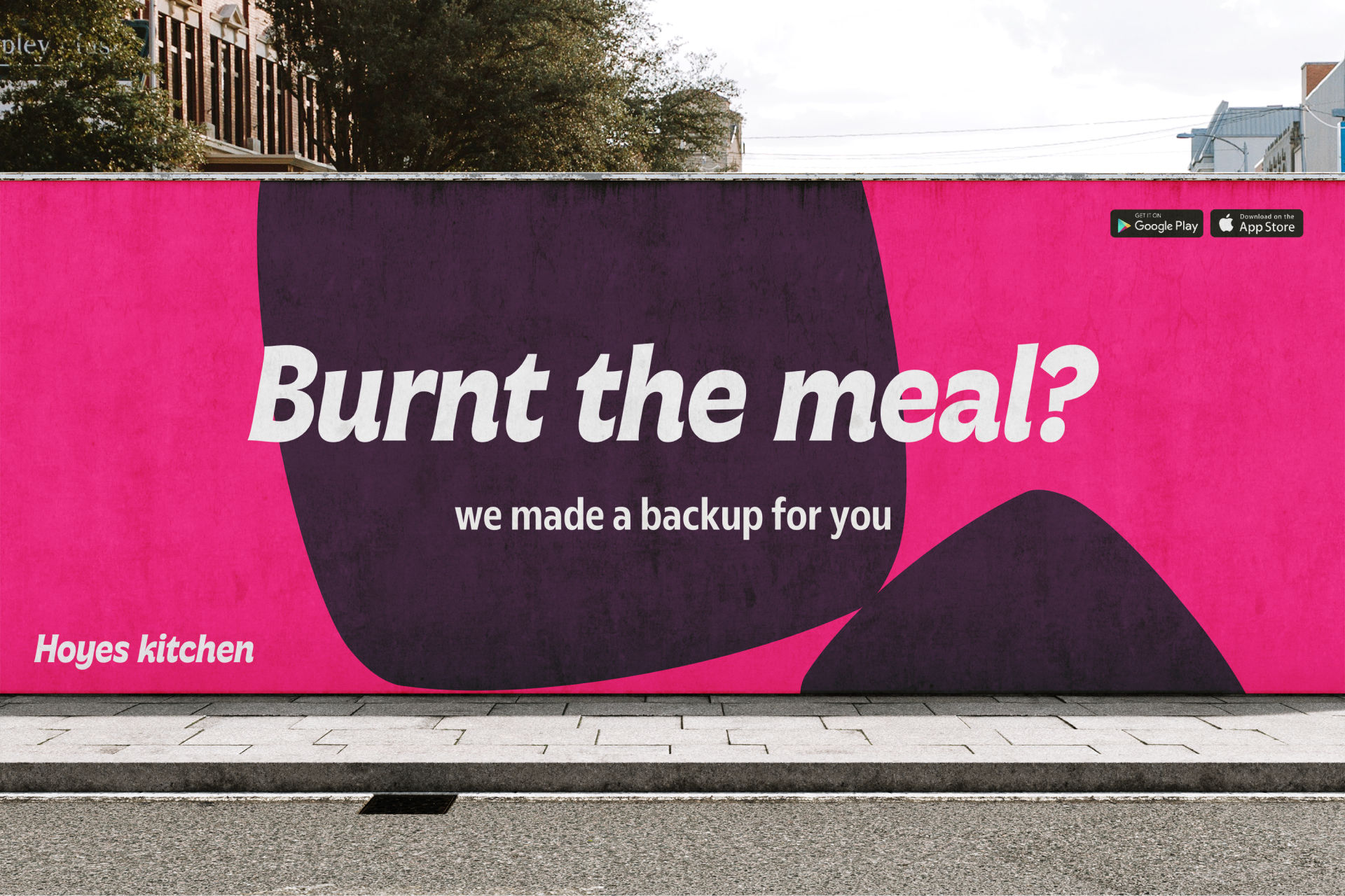
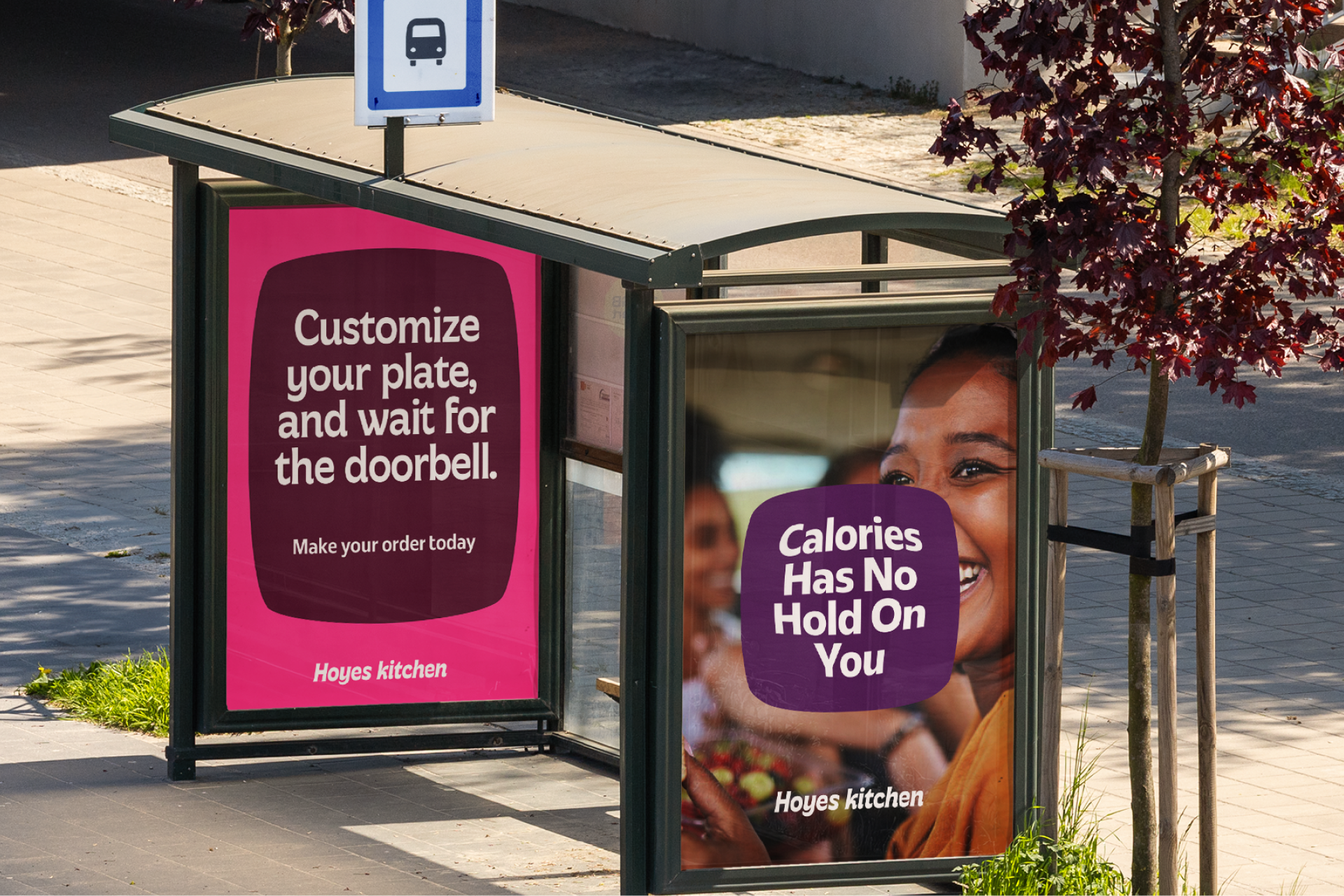
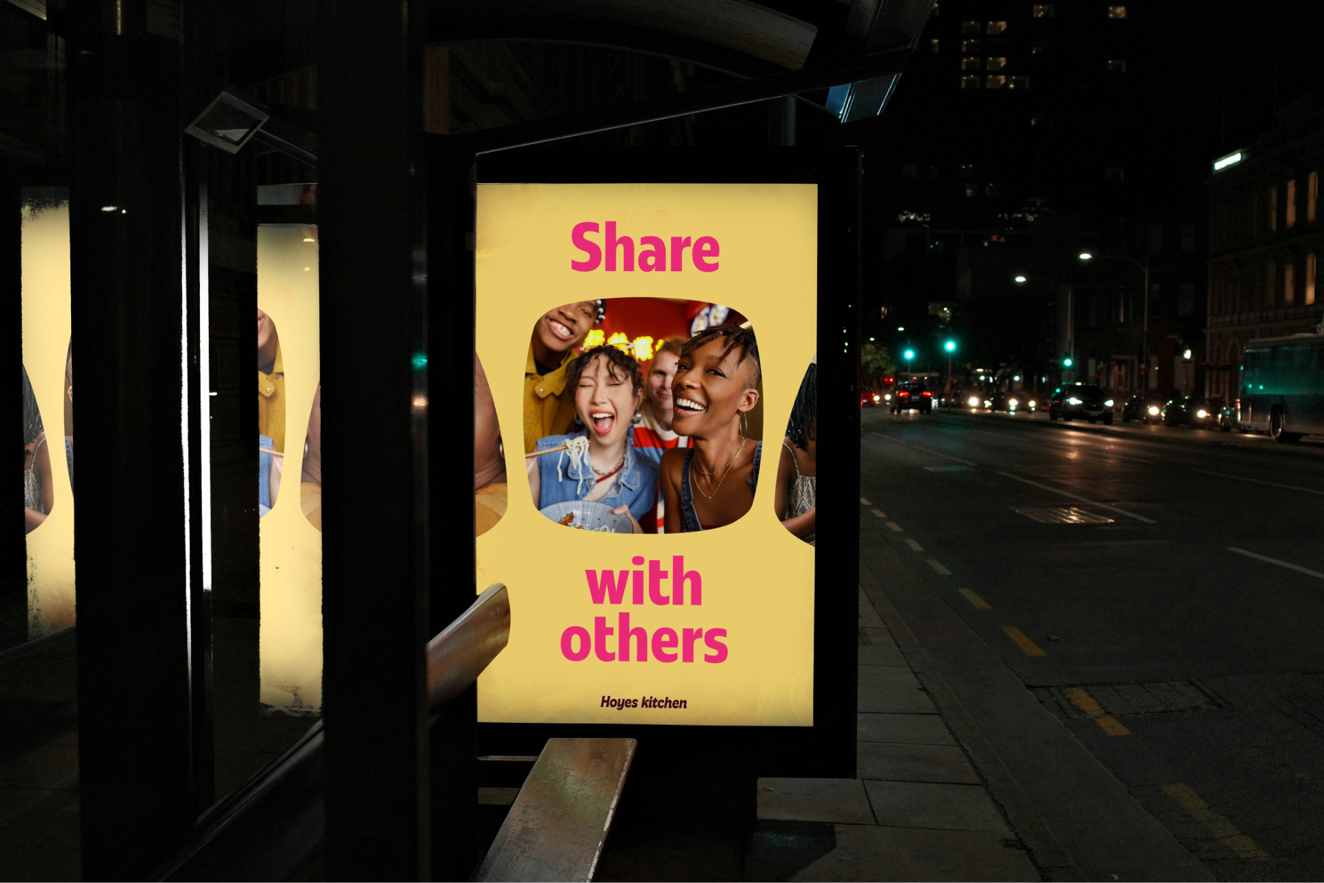
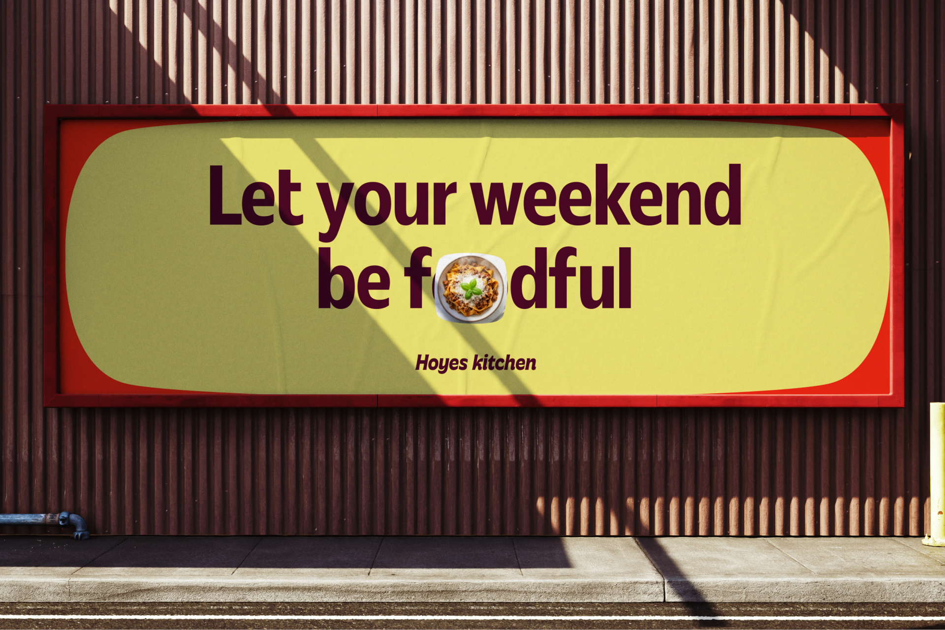
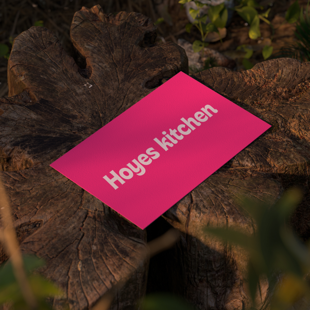
Hoyes Kitchen
Everything you need in one basket
Project Type
Greenfed is a community-driven grocery brand built around making fresh, locally sourced food more affordable. By enabling people to buy in bulk and share, Greenfed helps customers save money while supporting farmers and making quality food more accessible.
The identity is built around the idea “All your food in one basket.” The basket becomes a symbol of trust, choice, convenience, and community, bringing Greenfed’s products, people, and purpose together.
This idea shapes the entire visual system. Bold, rounded typography reflects the soft curves of a basket, while a nature-inspired colour palette combines vibrant greens with earthy tones to express freshness, growth, and authenticity. The brand device takes cues from stacking baskets and carts, representing connection and abundance. Organic kidney-bean-inspired buttons add a playful touch, while a woven basket pattern represents collaboration, togetherness, and the strength of community.
Together, the identity creates a brand that feels fresh, friendly, bold, natural, and accessible, turning a familiar grocery experience into a visual expression of community and shared value.
Next projects

Hoyes
Brand Identity, Motion, Copywriting
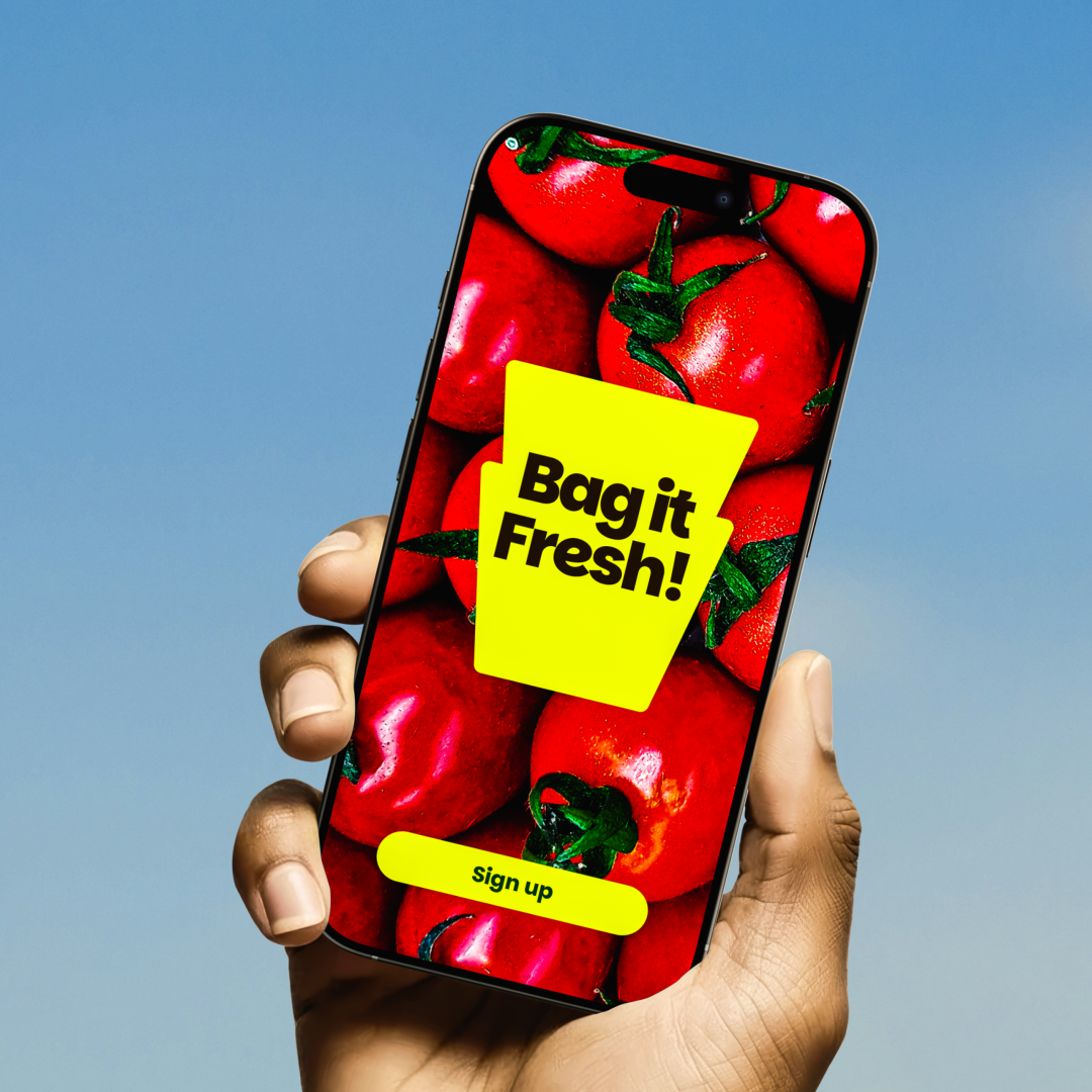
Greenfed
Brand Identity, Motion, Copywriting
Nifest
Brand Strategy and Identity, Copywriting
Next project

Nifest
Lorem ipsum dolor sit amet, consectetur
