

Hoyes Kitchen
Everything you need in one basket
Project Type
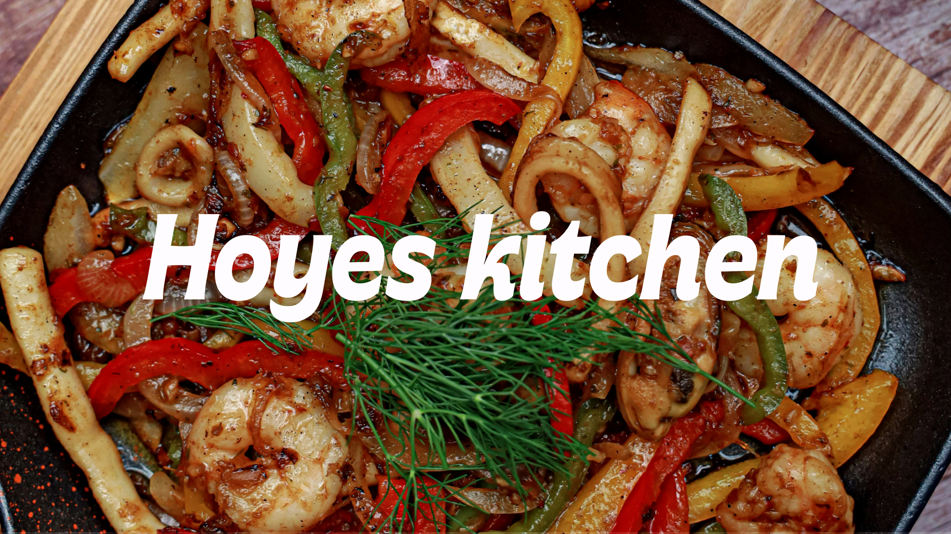
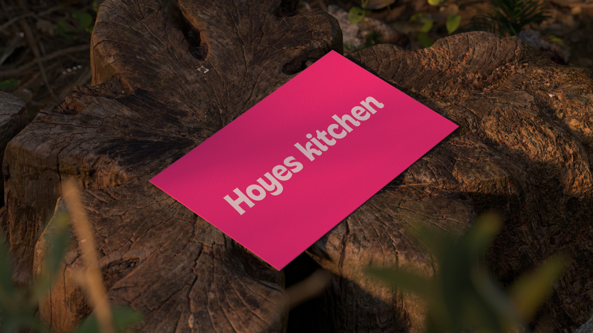
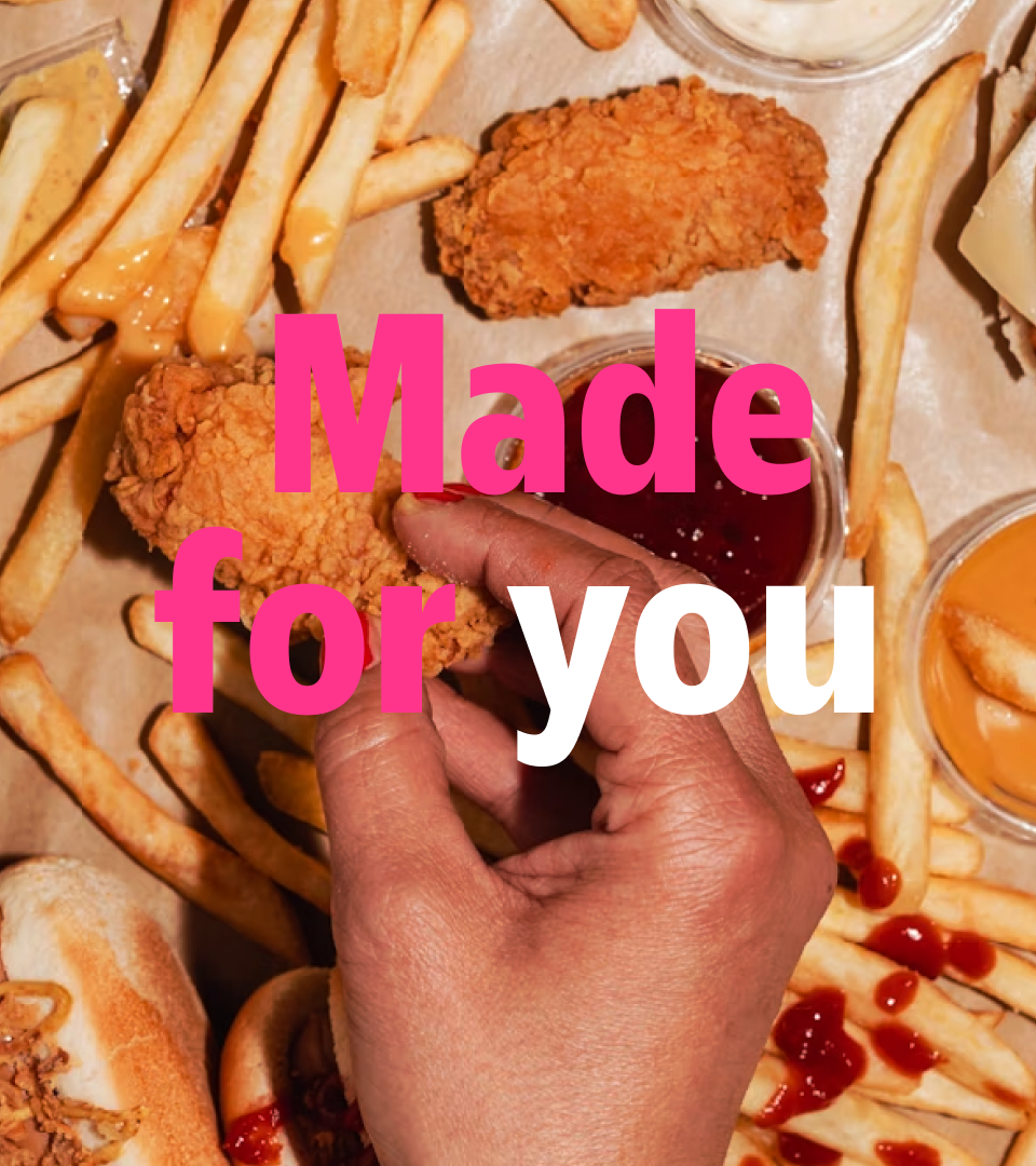
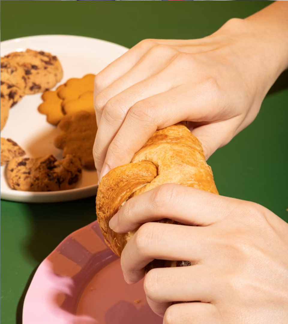
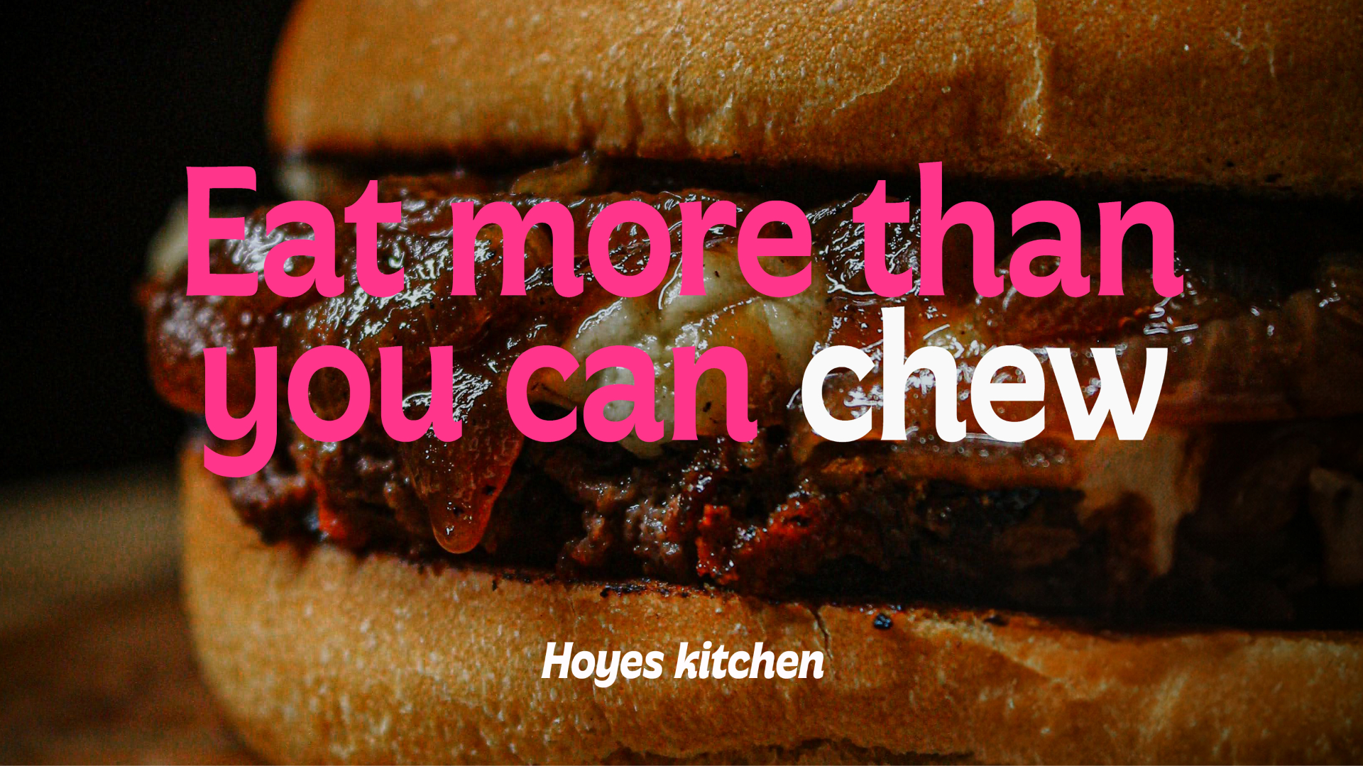
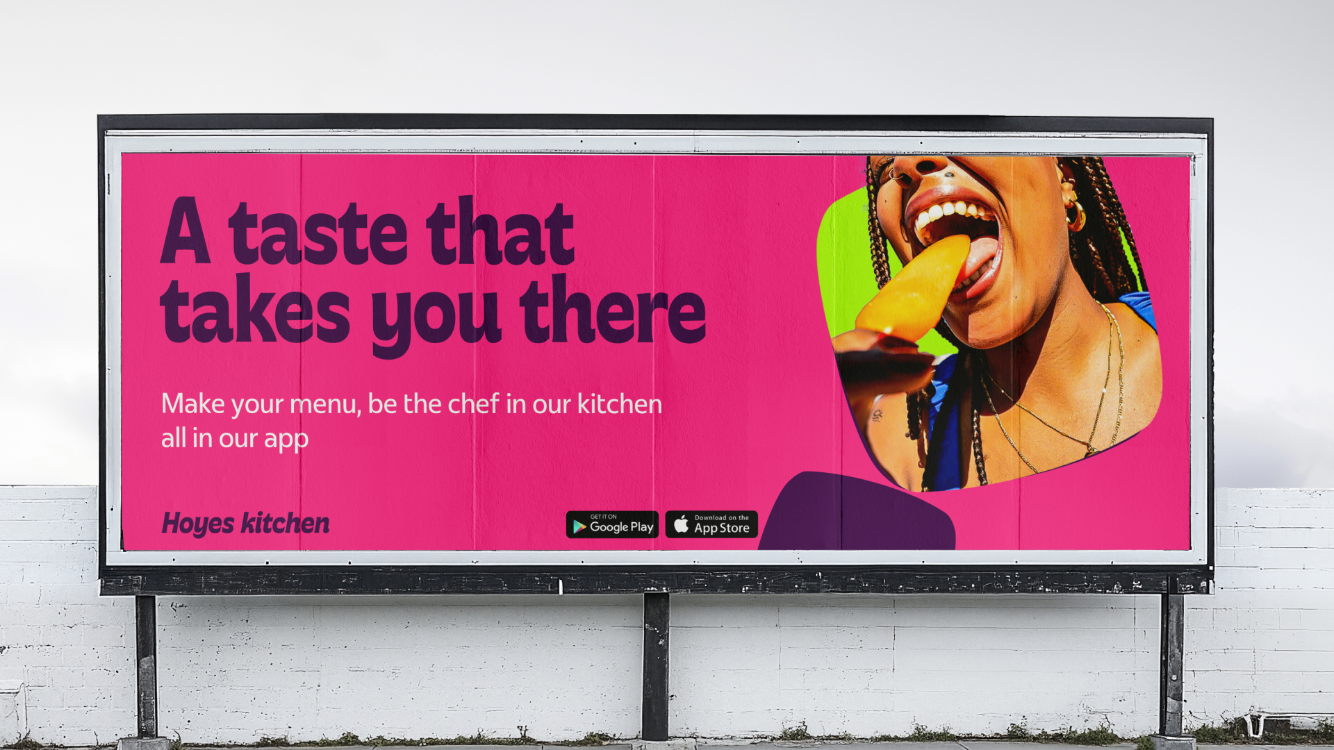
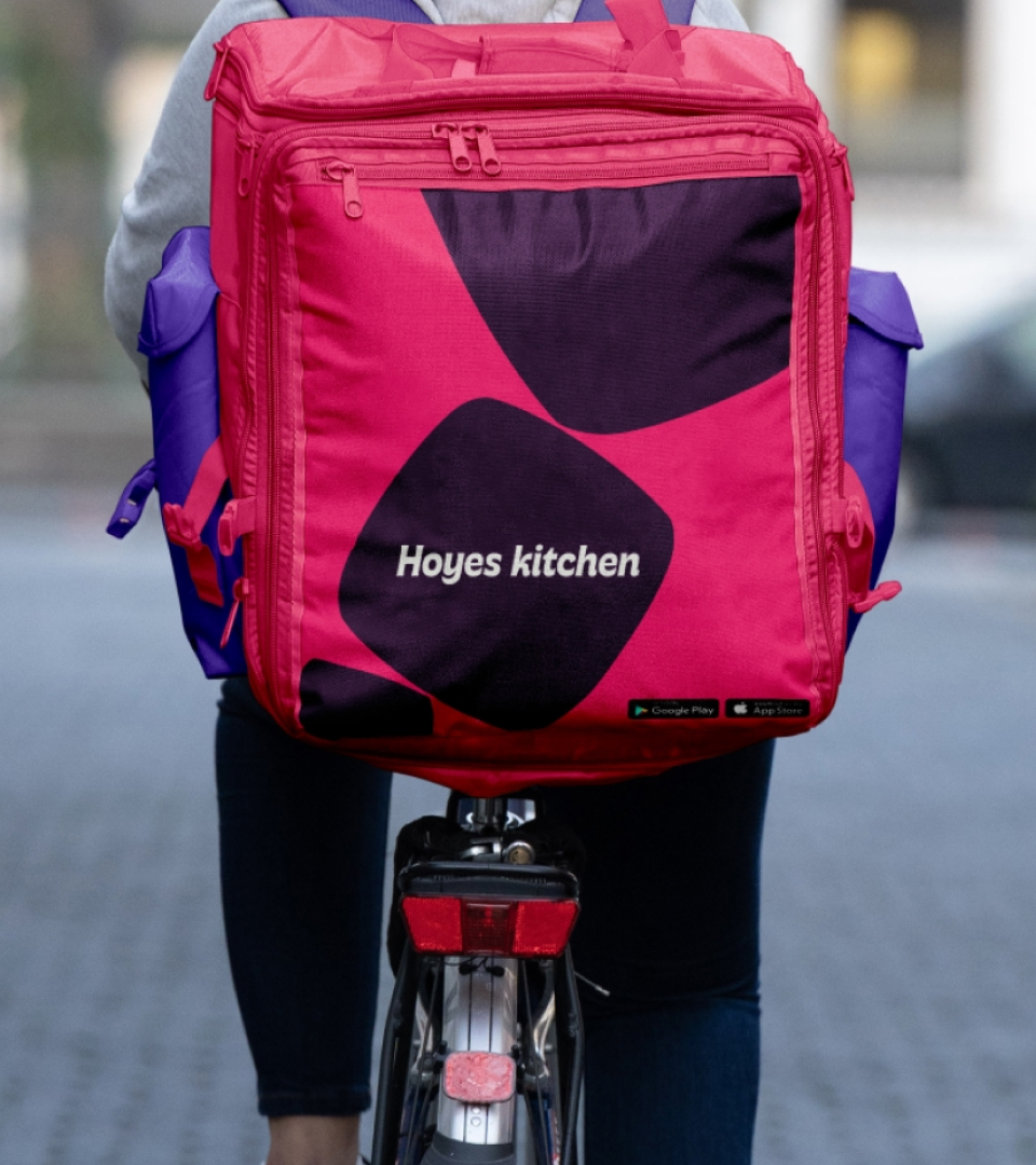
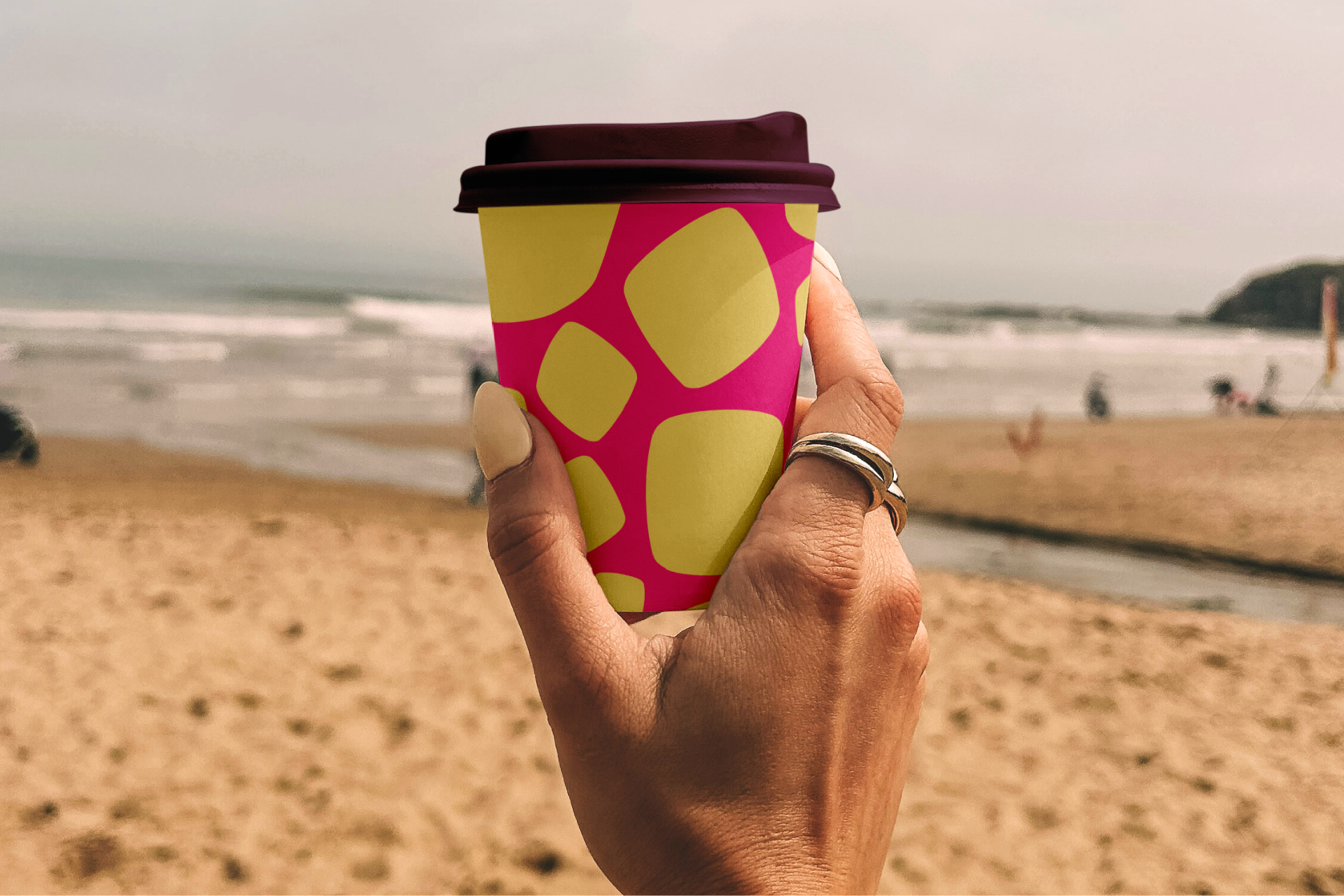
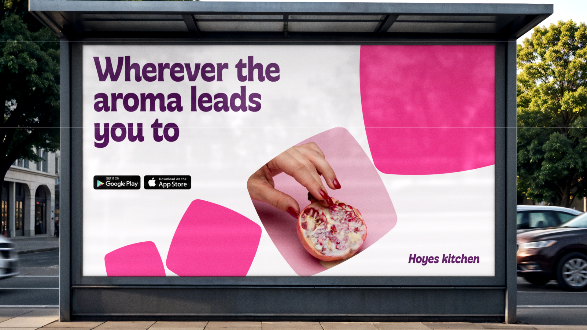
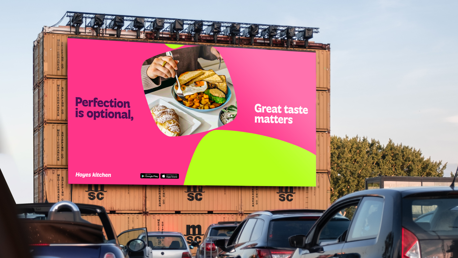
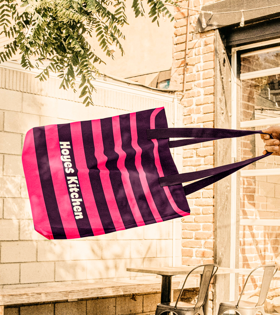
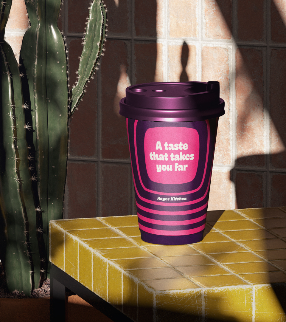
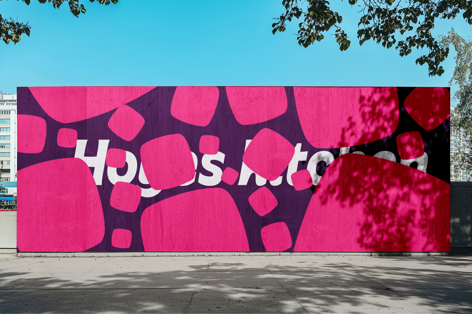
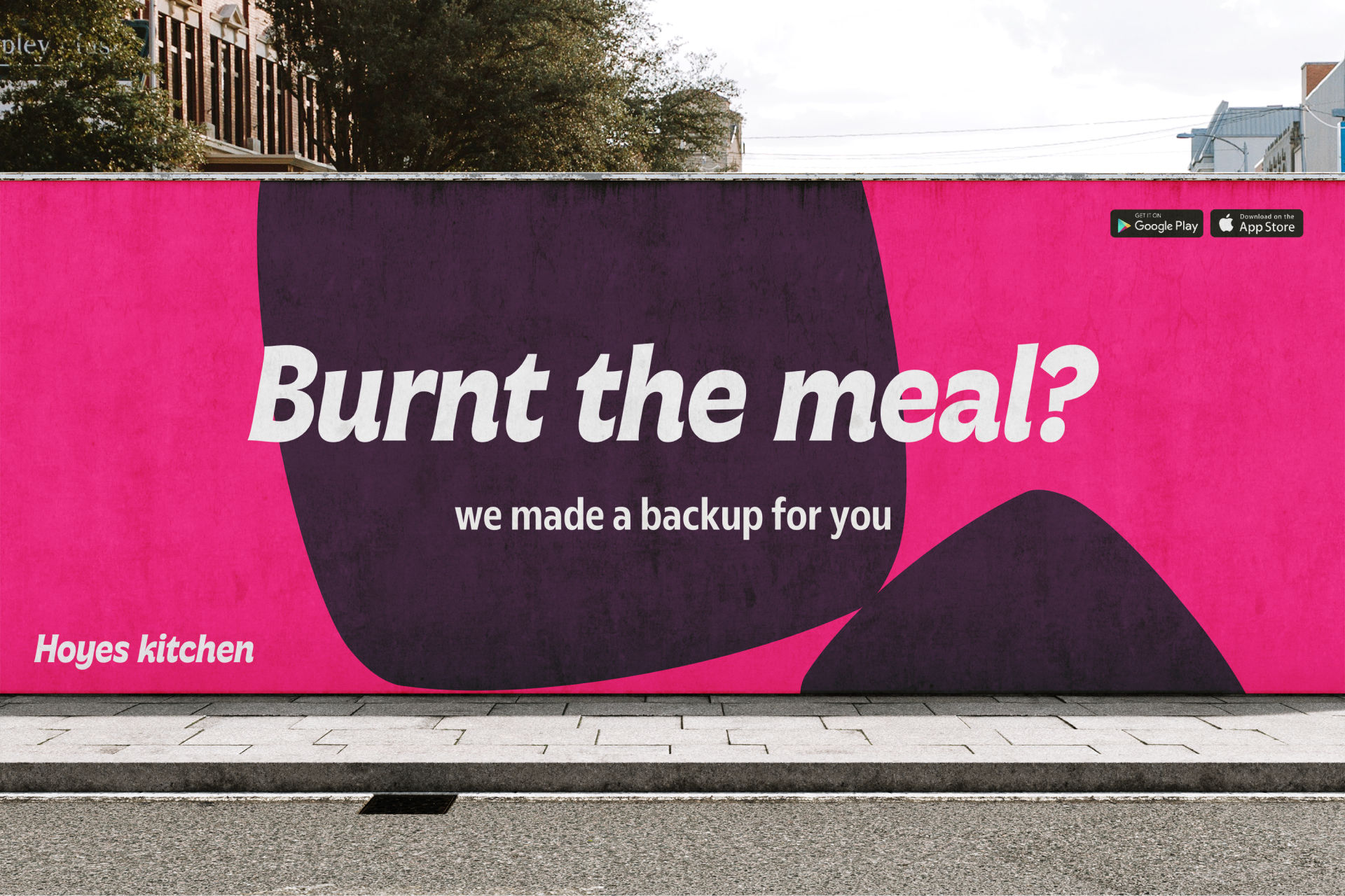
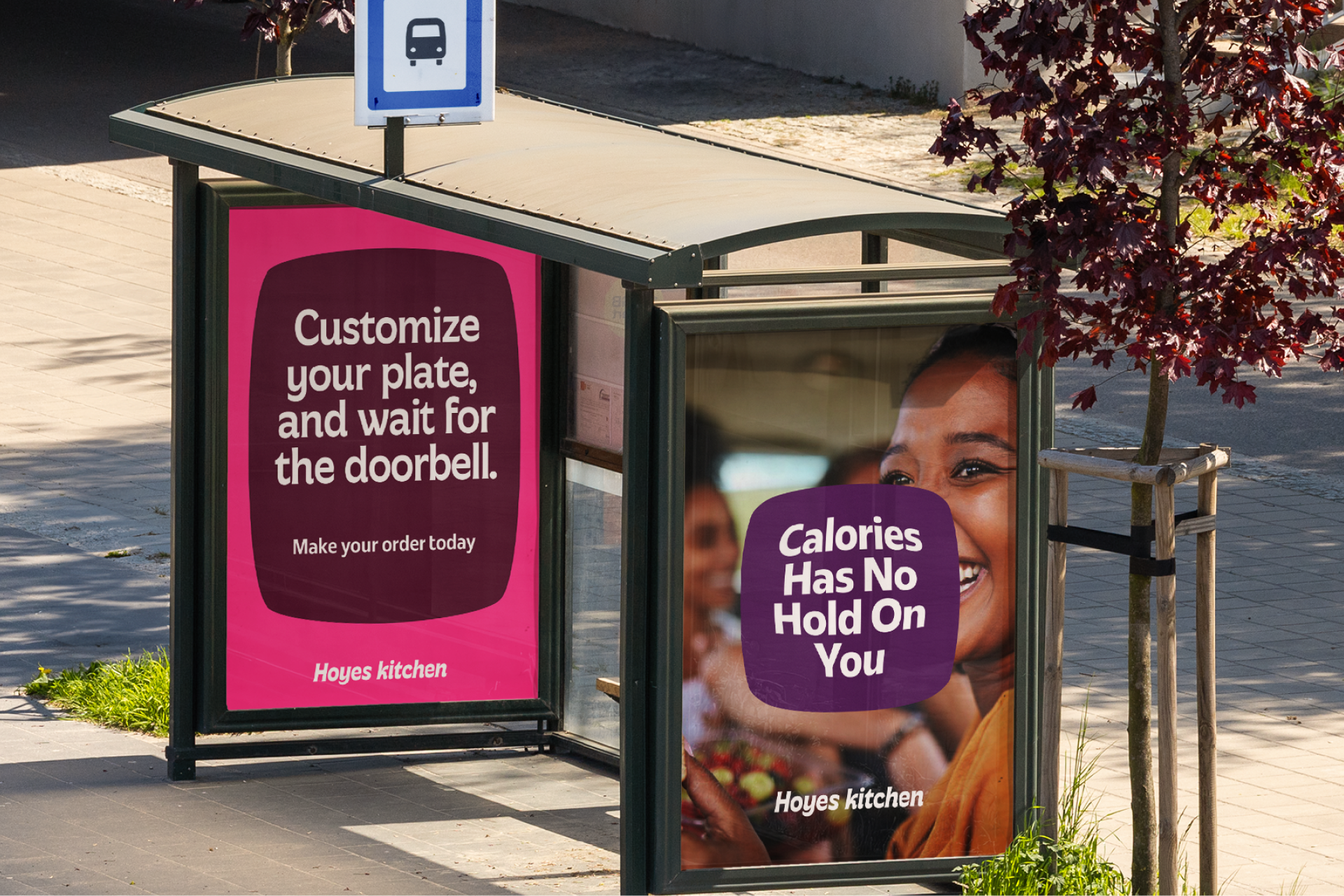
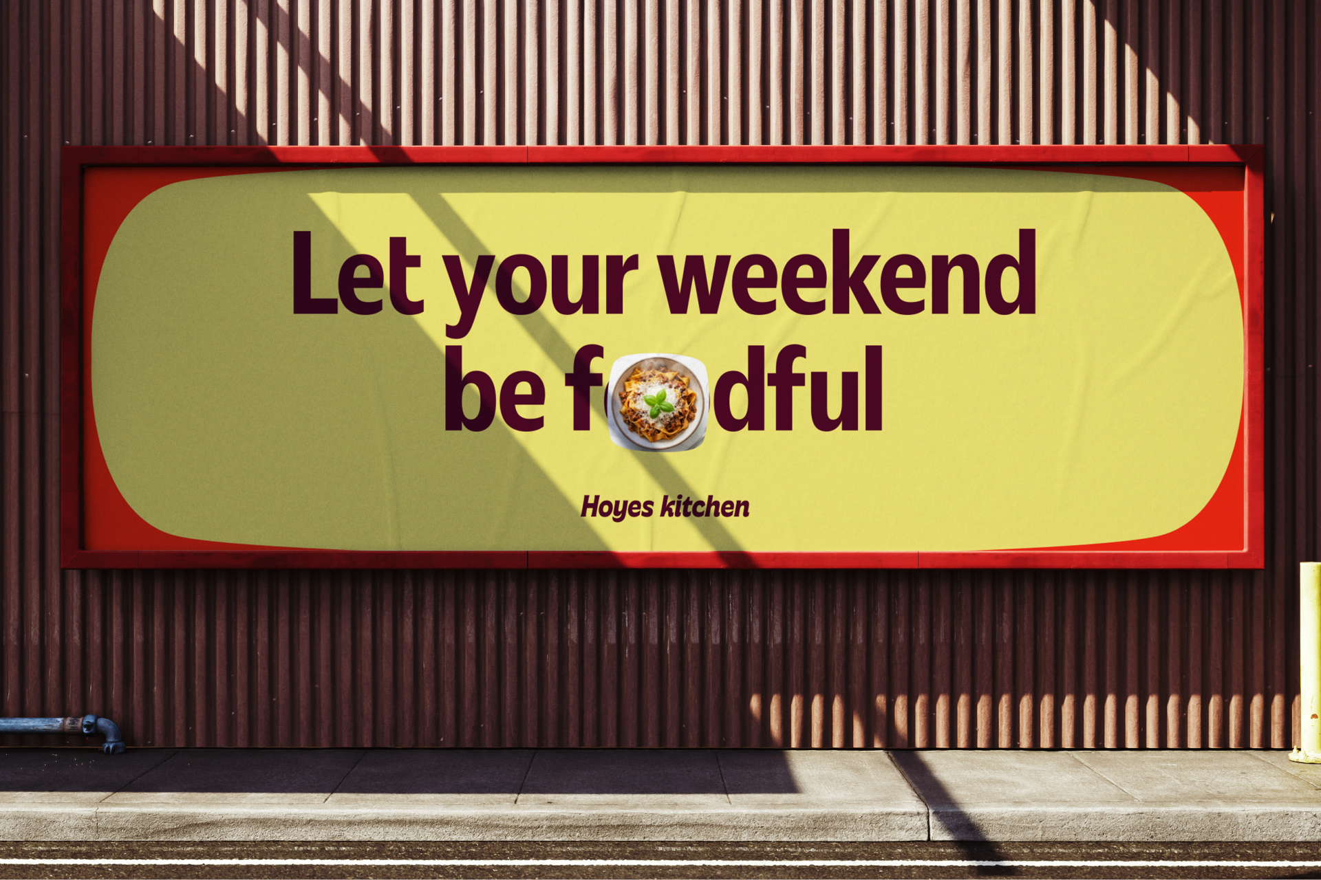
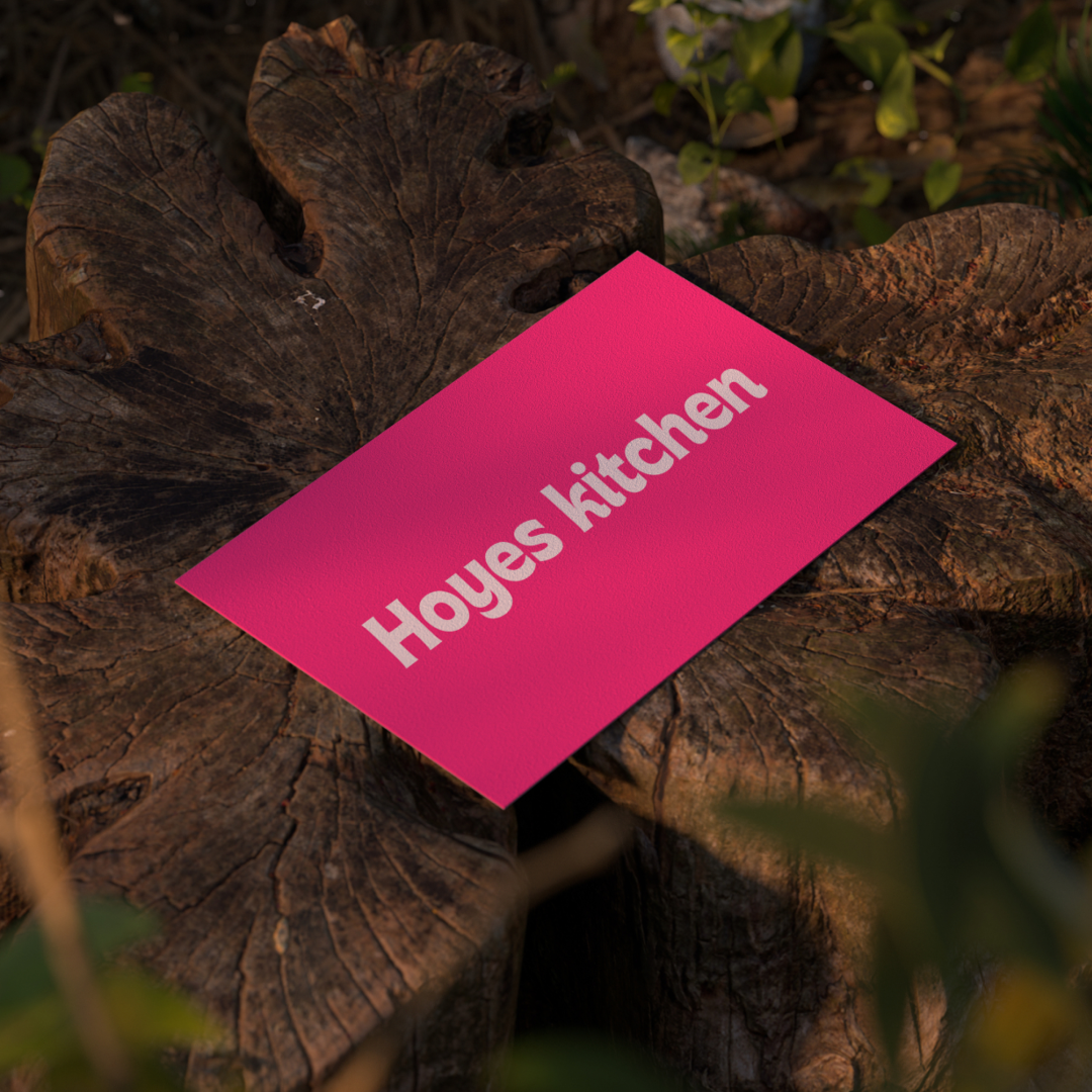
Hoyes Kitchen is founded on the principle that ‘everyone has a craving.’ At Hoyes Kitchen, they are committed to satisfying these cravings with bold flavors and delicious meals. This philosophy inspired the design of the wordmark, which features a bold italic font, as well as the choice of vibrant colors drawn from the ingredients themselves, symbolizing freshness and flavor.
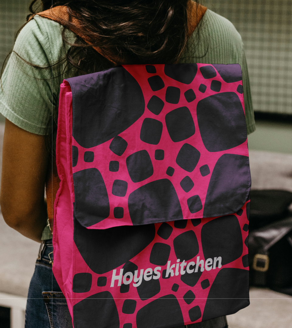
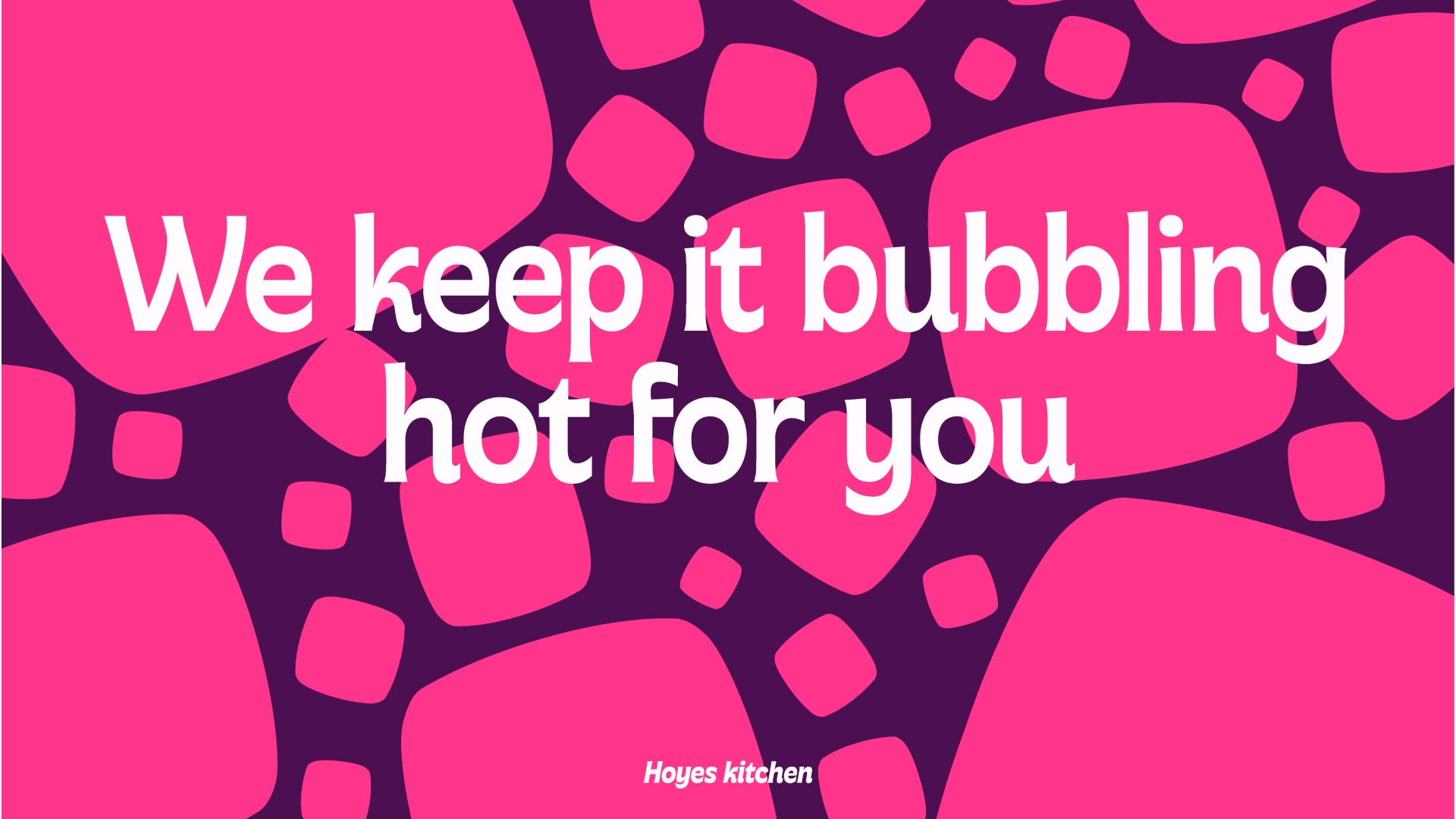
Hoyes Kitchen believes that when people want to enjoy their meal, they prefer to watch and eat simultaneously. This belief led to the creation of the brand container—a versatile holding device used for displaying images and food presentations. Additionally, the container’s pattern was inspired by steam bubbles rising during cooking, adding a dynamic visual element that evokes the sensation of freshly prepared food.
Next projects

Hoyes
Brand Identity, Motion, Copywriting
Greenfed
Brand Identity, Motion, Copywriting

Nifest
Brand Strategy and Identity, Copywriting
Next project

Nifest
Lorem ipsum dolor sit amet, consectetur
